
mateja@portfolio:~$ ./boot --case 04
- client
- Imperial Code Technology, Dubai
- scope
- identity and corporate site, 12 pages
- role
- Design & Full-stack Development
- year
- 2025
- live
- imperialct.ae
One company. Eight disciplines. Zero stock photos.
Identity and website for a Dubai technology company that works the whole stack, from cybersecurity to games.
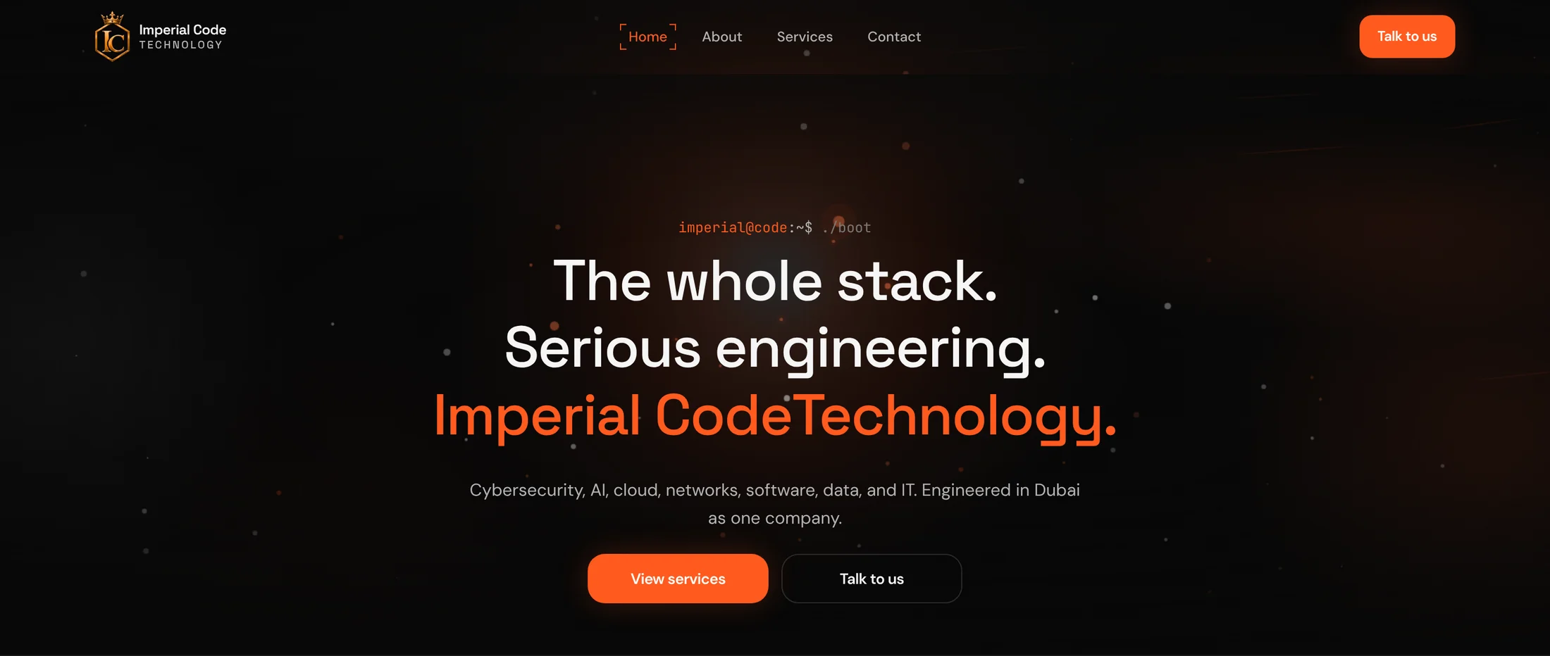
mateja@portfolio:~$ ./overview
A website for a company that works the whole stack.
Imperial Code Technology is a Dubai company that works across eight disciplines, from cybersecurity and cloud to AI and game development. I designed its identity and built its twelve-page website.
- audience
- CISOs, CTOs, heads of infrastructure
- role
- Design & Full-stack Development
- scope
- identity, 12 pages, 8 practice pages
- language
- en-AE
mateja@portfolio:~$ ./problem
Eight disciplines look like “we do everything”.
A buyer looking for a security partner doesn’t want a company that also makes games. Listed side by side, eight disciplines made a serious engineering firm look like a generalist, and generalists don’t get shortlisted.
// what stood in the way
- [!]Breadth reads as shallowness. If a company does eight things, a buyer assumes it does none of them deeply.
- [!]The buyer came for one thing. A CISO has to dig through seven services that aren’t theirs to find the one that is.
- [!]The audience is technical and sceptical. Anything that looks like a template or a stock photograph counts against you.
mateja@portfolio:~$ ./approach
Prove depth first. Then show it is one team.
Breadth is only a problem when it looks shallow. So the site does two things, in order. It gives every discipline a full page of its own, so each buyer meets a specialist. Then it shows that the eight specialists are one company with one line of responsibility, which is what a buyer wants: fewer vendors to manage.
// the plan
- [+]One sentence on the first screen, not a list of eight.
- [+]A full page for every practice, all built the same way.
- [+]The buyer’s own language: the terminal.
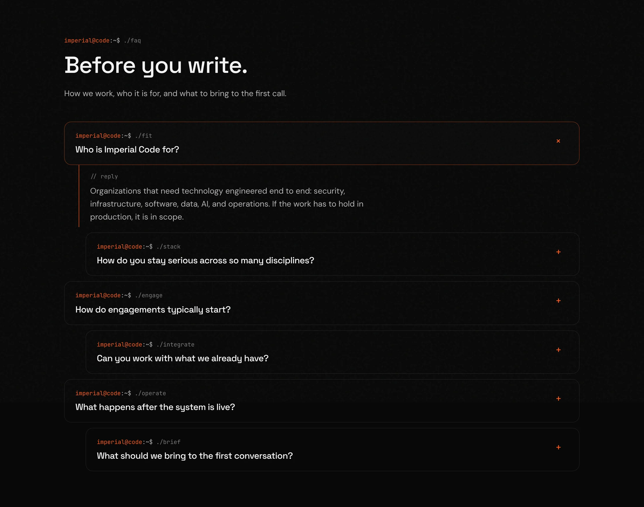
- [+]The obvious doubt answered on the page, in the FAQ.
// design: three decisions, and the reason for each
mateja@portfolio:~$ ./design --position
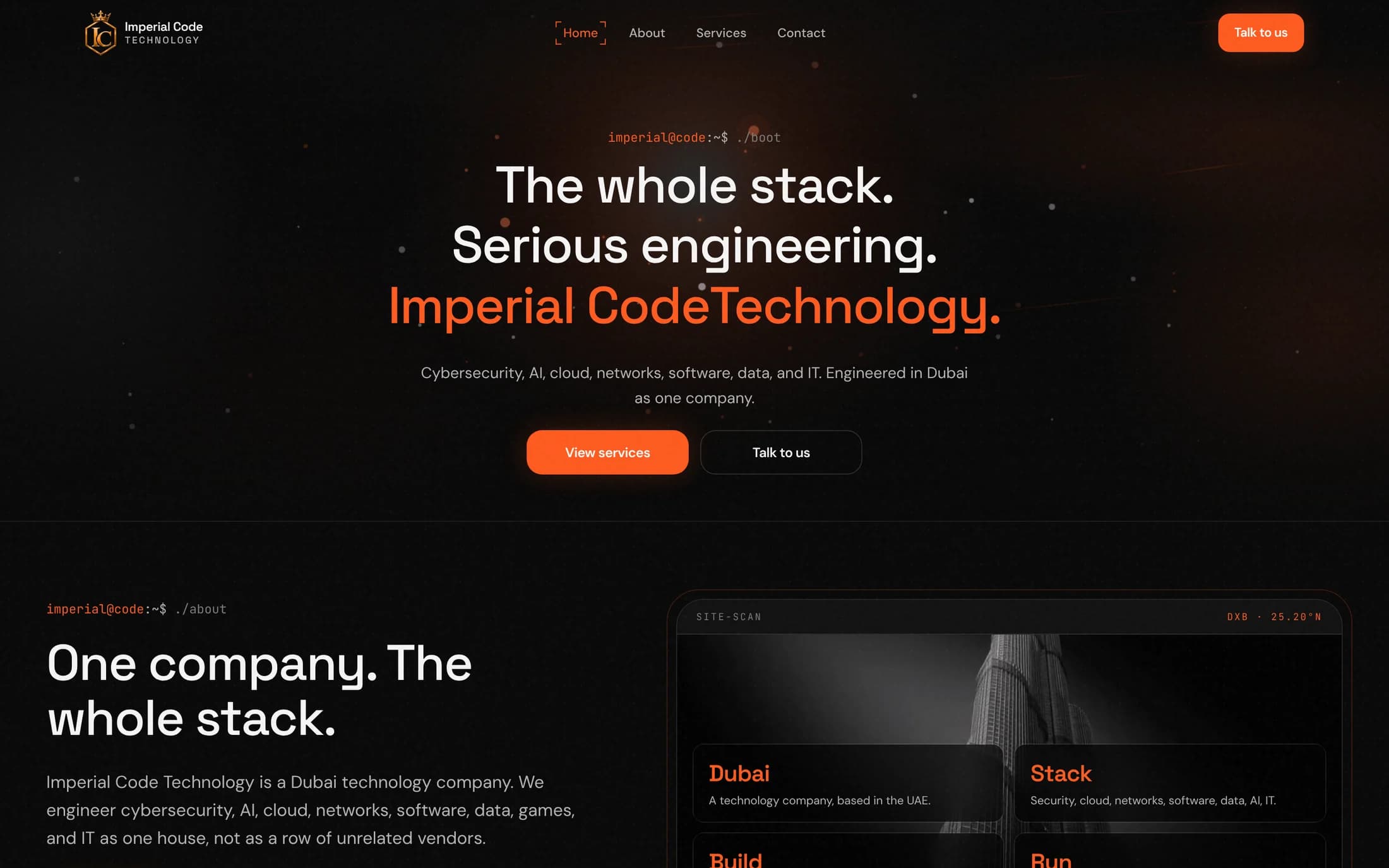
One position on the first screen, not eight services.
- // why
- The first screen decides whether a visitor files the company under specialist or generalist. So it doesn’t list anything. It says “The whole stack. Serious engineering.”, and the eight areas appear only as one supporting sentence. The breadth is presented as a single offer: one partner for the whole stack.
- // what the client gets
- The first impression is a company with a clear position, and the breadth arrives as a benefit instead of a warning sign.
mateja@portfolio:~$ ./design --practices
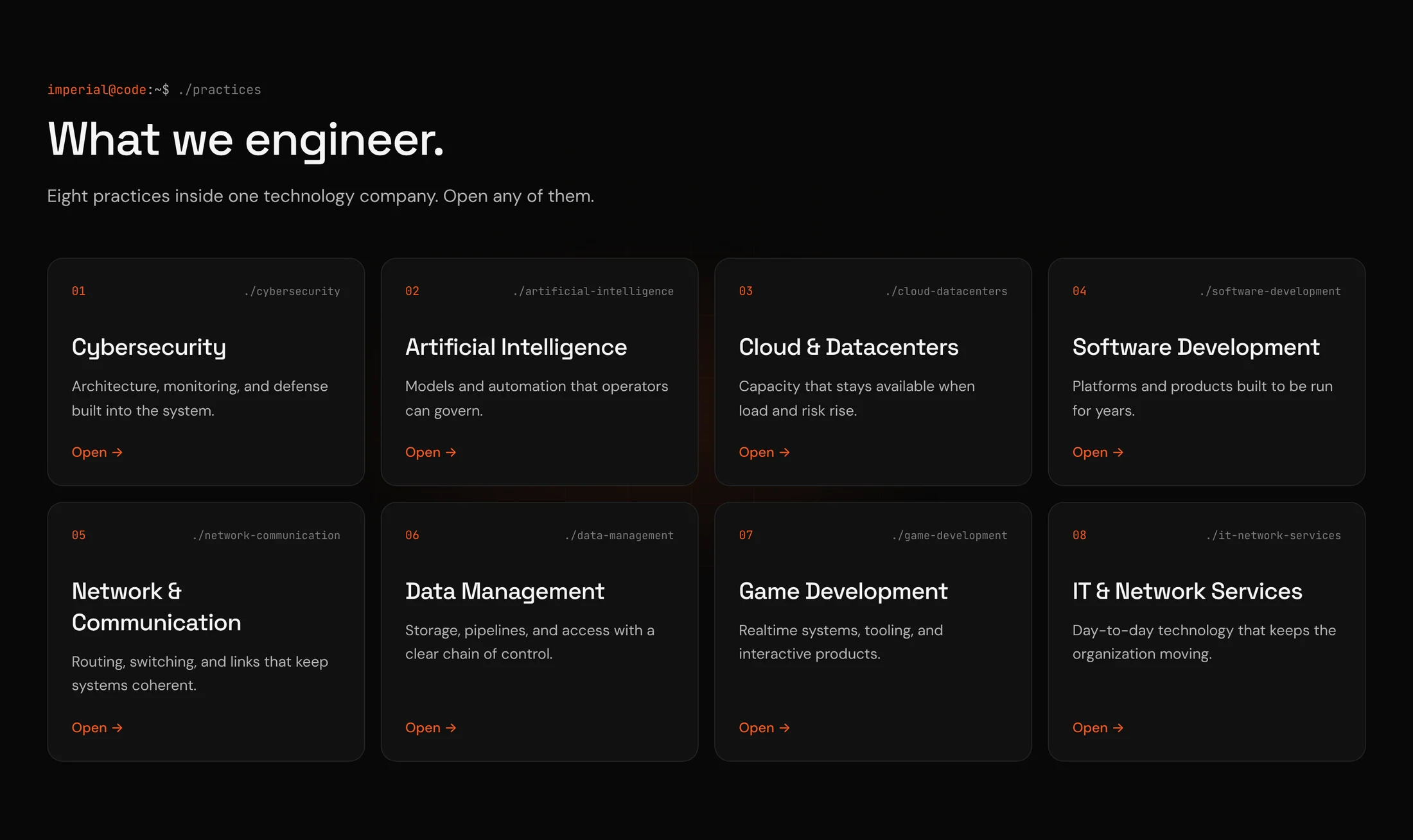
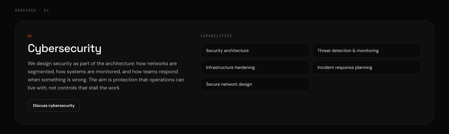
Every practice gets the same card, and a page of its own.
- // why
- On the home page the eight practices are one numbered set, 01 to 08, each with a name and one sentence about the outcome instead of the technology. Each card opens a full page about that practice alone. A CISO lands on cybersecurity and reads only about cybersecurity.
- // what the client gets
- Each buyer sees a specialist in their own field. The shared format is what tells them the specialists are one team.
mateja@portfolio:~$ ./design --voice
The site speaks the buyer’s language.
- // why
- The people who sign these contracts are engineers. Every section opens with a command (./about, ./practices, ./faq), labels are set in a monospace, and there is no stock photography anywhere. The FAQ takes on the obvious question directly: how do you stay serious across so many disciplines?
- // what the client gets
- A technical buyer sees engineers, not marketers, and has their main doubt answered before the first call.
// colour and type
Colour
- Ground
#080808Near-black, like the terminal the buyers work in. With no photographs on the page, the dark ground lets type and spacing carry the weight. - Orange
#ff5a1fThe only accent, kept for actions and status indicators. Not hacker green and not corporate blue: those are what every other firm in the sector uses. - Text
#f5f5f7A soft white. Pure white on black glares over long reading, and this audience reads the details.
Type
- Space GroteskHeadlinesTechnical in its shapes but with some warmth, so the company sounds like engineers who can also talk to a board.
- DM SansRunning textPlain and quiet. The longer explanations shouldn’t feel like reading a console.
- JetBrains MonoCommands and labelsThe typeface many engineers look at all day. It makes the commands read as real, not as decoration.
// development: what I built
mateja@portfolio:~$ ./build
Twelve pages that behave like one system.
The argument for “one team” only holds if the site itself is consistent. So the eight practice pages share one template, and everything else is built from the same small set of parts.
- Next.js
- React
- Tailwind CSS
- Eight practice pages from one template.Every practice has the same structure and its own address, title and description, so each can rank in search and work as the landing page for its own campaign.
- The boot sequence.The home page opens like a system starting up, with text that types itself in. It is the signature of the site.
- Recommendations you step through.Quotes type out one at a time, with a 01 / 04 counter and previous and next buttons. Nothing advances on its own.
- A contact page that asks about the problem.The form asks for the constraint, the environment and the outcome, not for details about the visitor.
- Light, and well described.Three images on the home page, four blocks of structured data, a skip link and high-contrast text.
mateja@portfolio:~$ ./result
What the company has now.
The breadth that used to raise a doubt now reads as the reason to call: one partner, eight specialists, one line of responsibility.
- 1Position on the first screen“The whole stack. Serious engineering.” The eight areas follow as one supporting sentence.
- 8Practices, each with a page of its ownA buyer reads only about their discipline, and each page can rank and be advertised separately.
- 12Pages in one systemThe same format and voice throughout, which is what makes eight specialists read as one company.
- 3Images on the home pageNo stock photography, so the page loads light and nothing on it is borrowed.
| A list of services | This site | |
|---|---|---|
| First screen | A list of everything the company does | One sentence that states the position |
| A buyer’s visit | Digging through eight services to find theirs | A full page about their discipline alone |
| Breadth | A reason for doubt | One partner for the whole stack |
| The main doubt | Left for the first call | Answered in the FAQ |